Next to
Job Clarendon,
everything else
is practically
a sans.

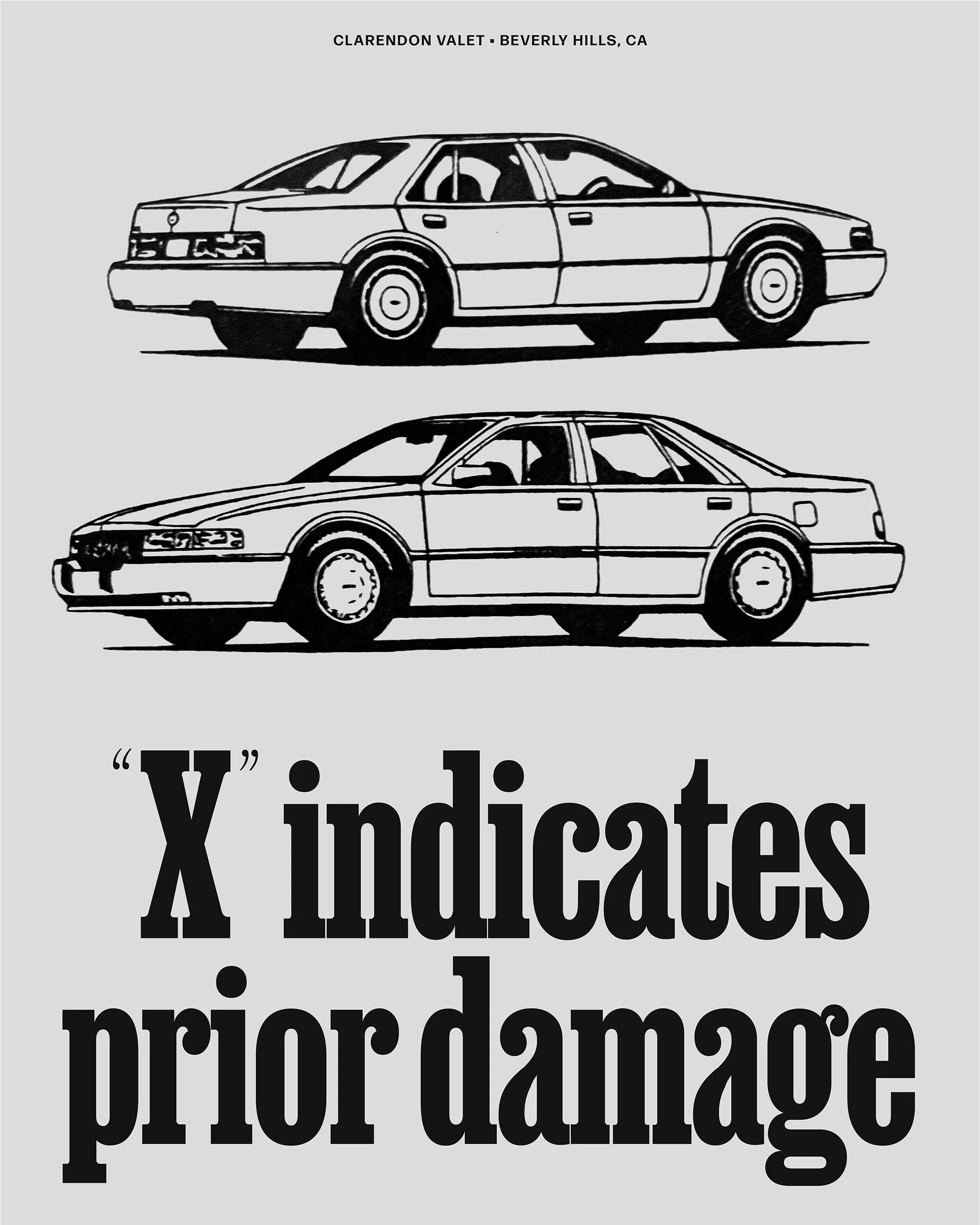
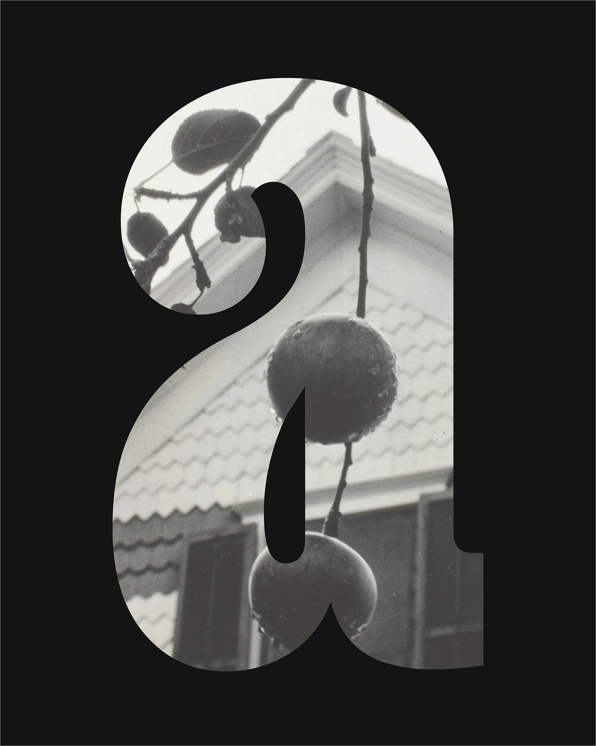
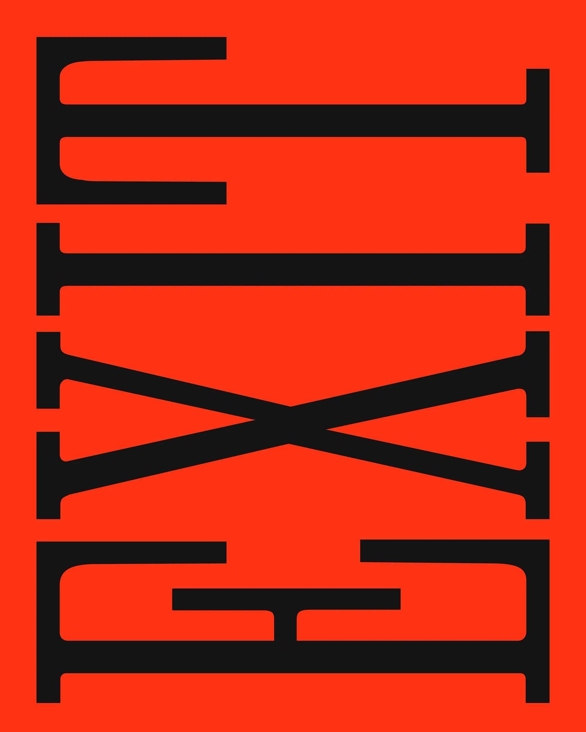
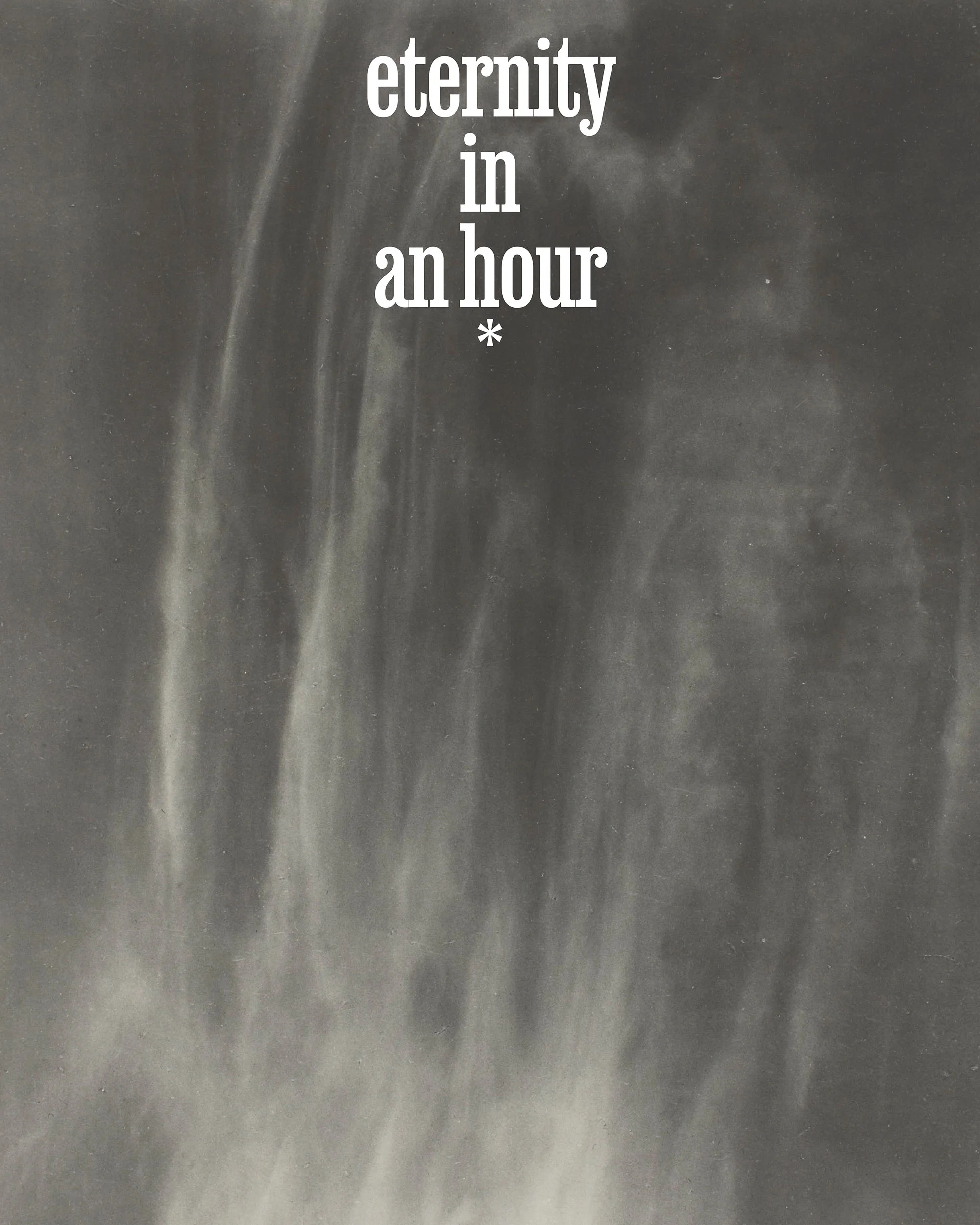
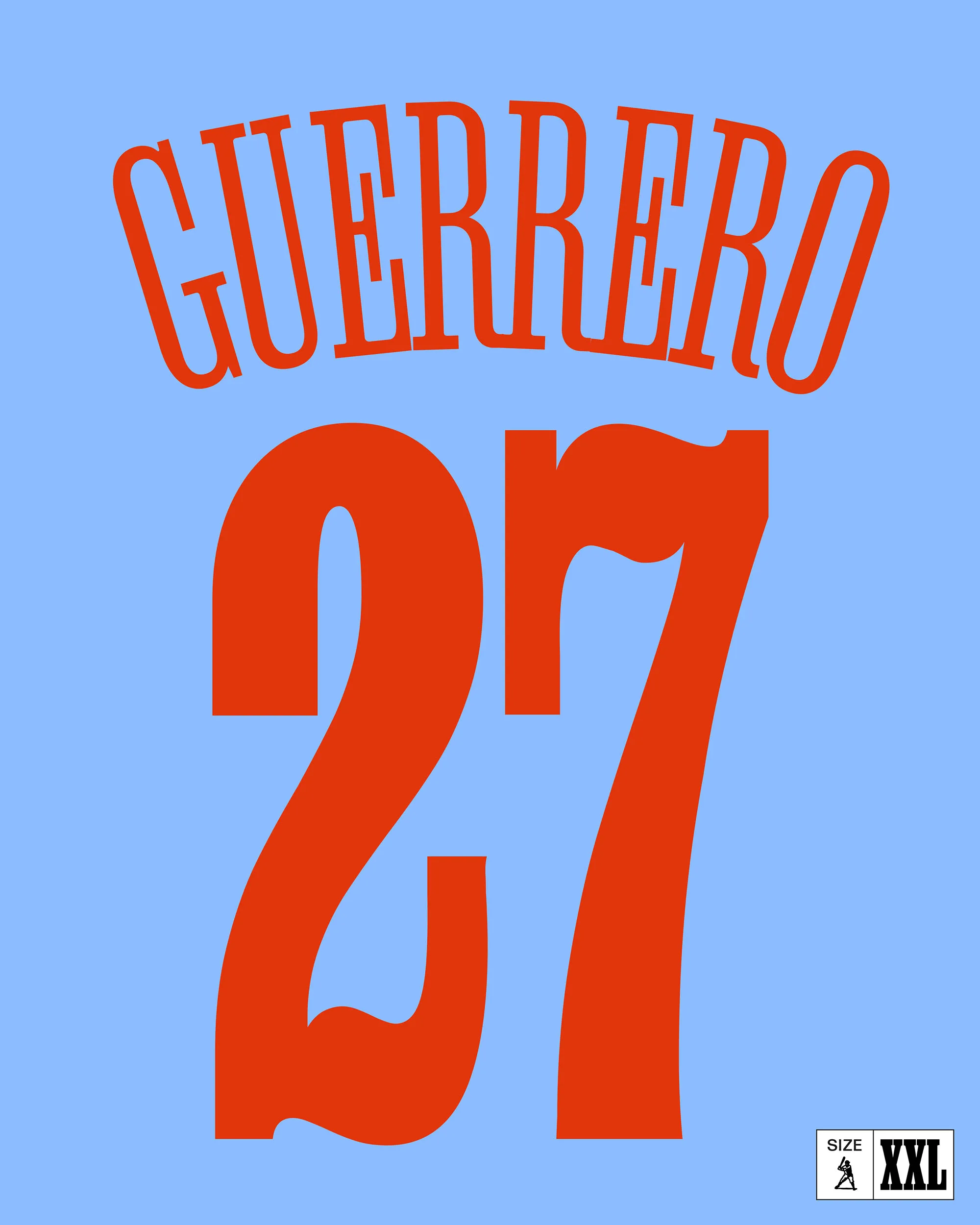
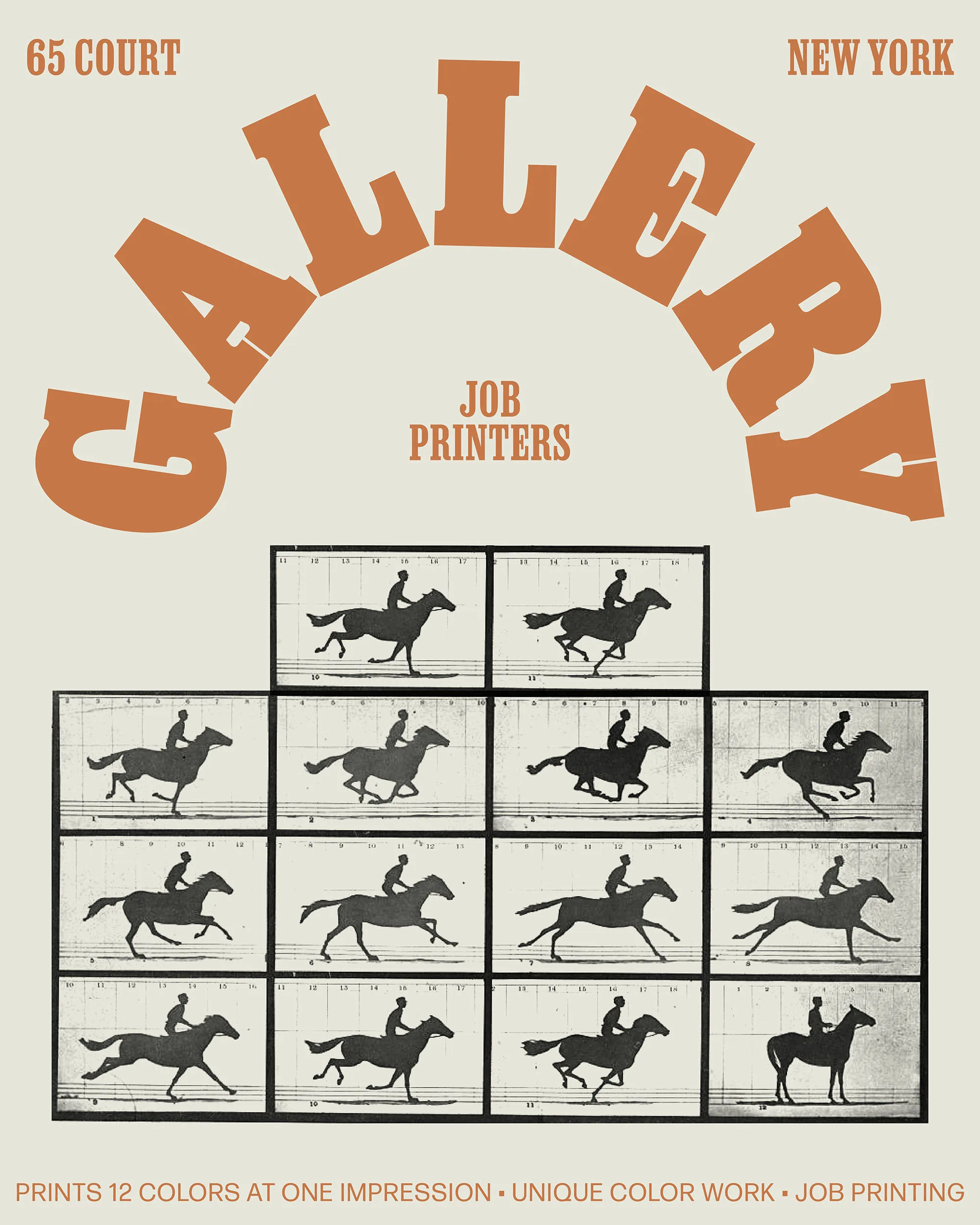
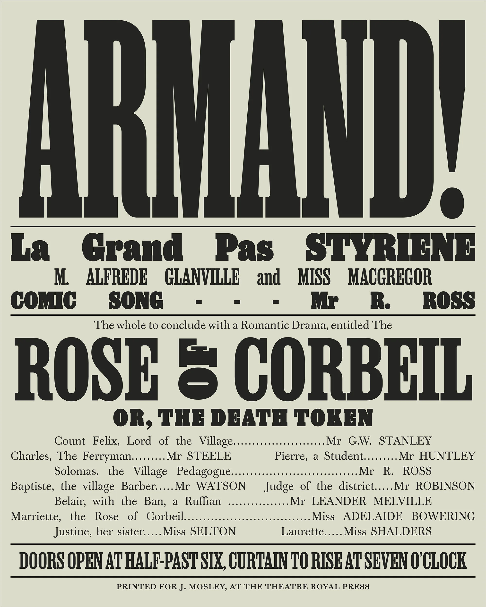
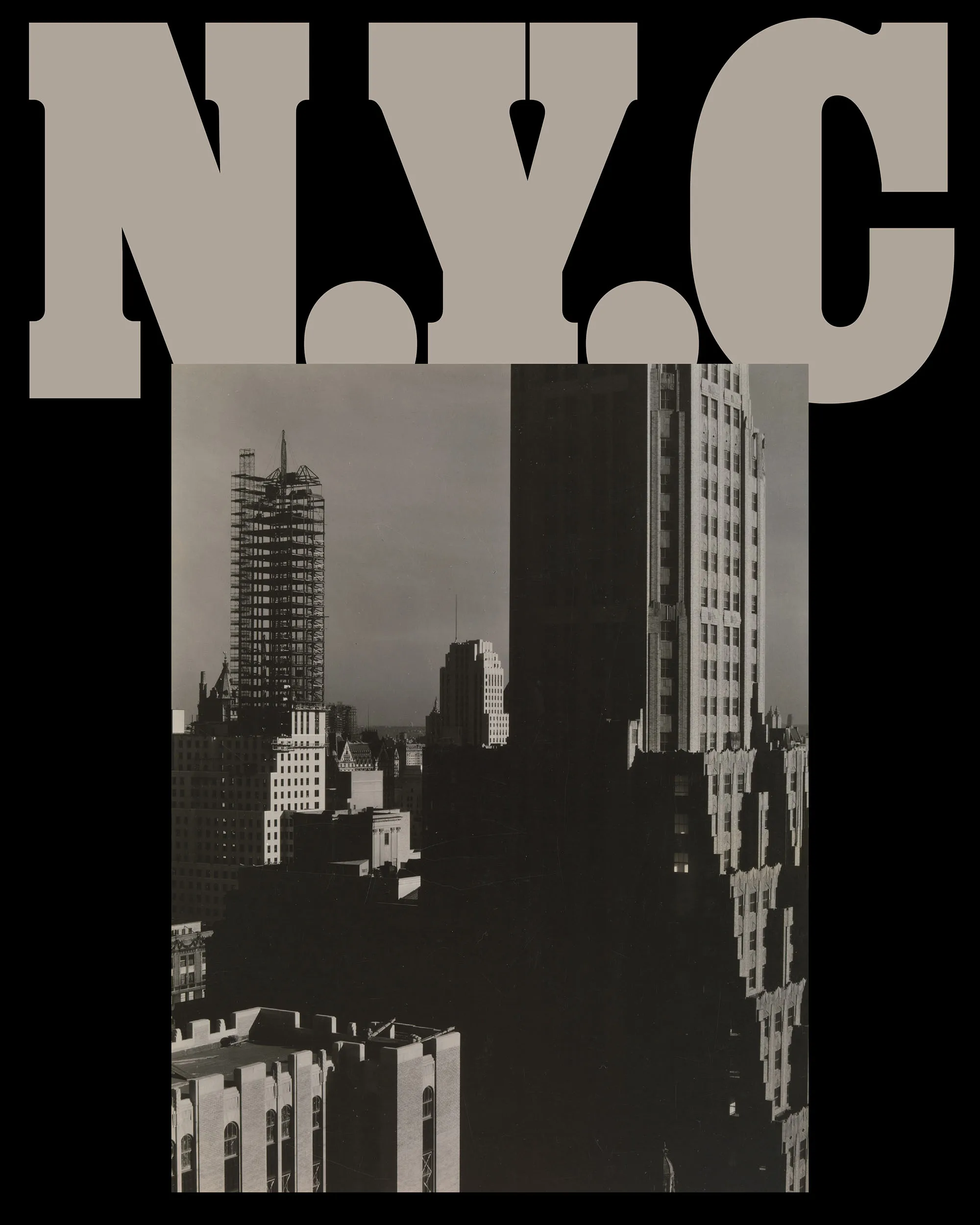
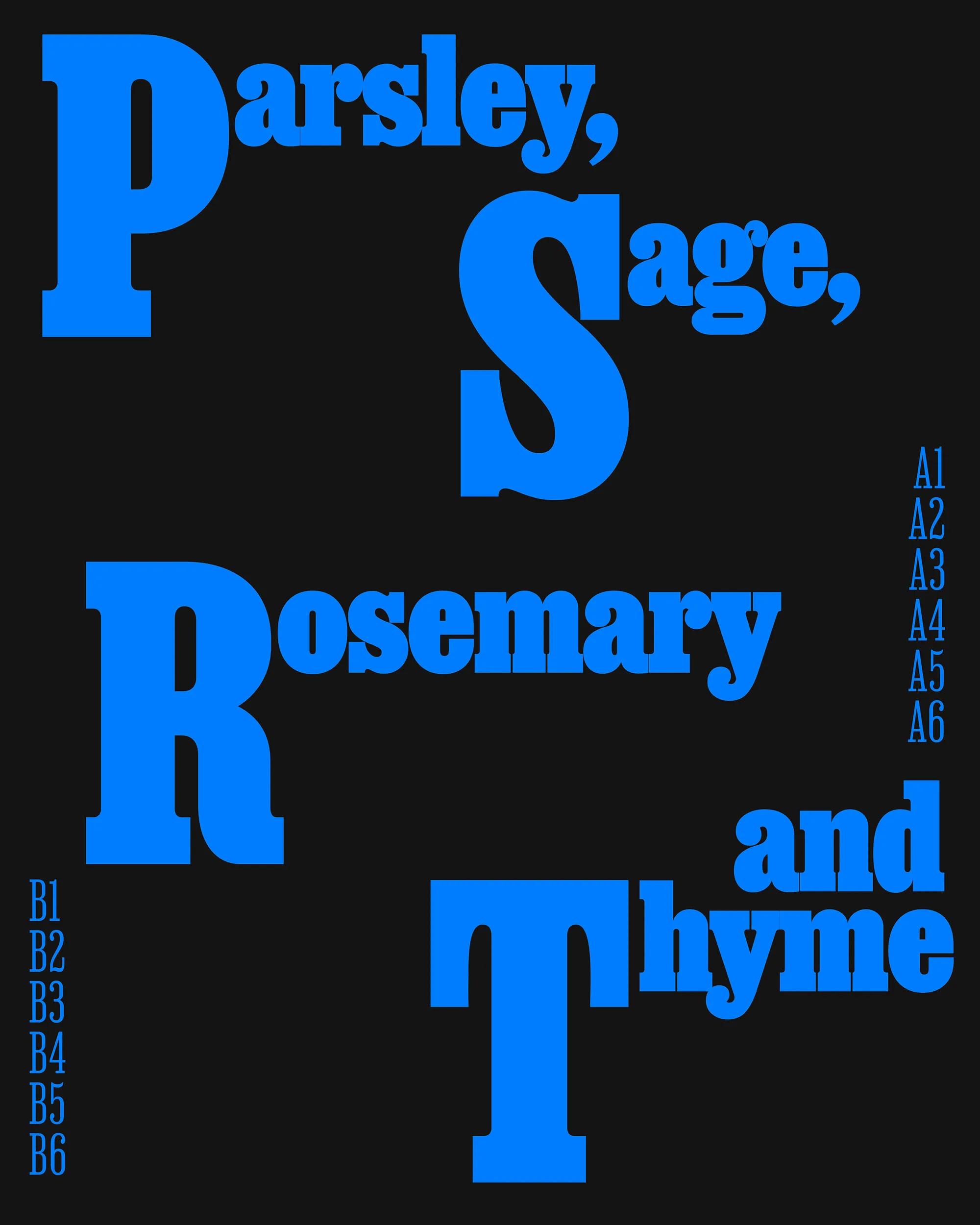
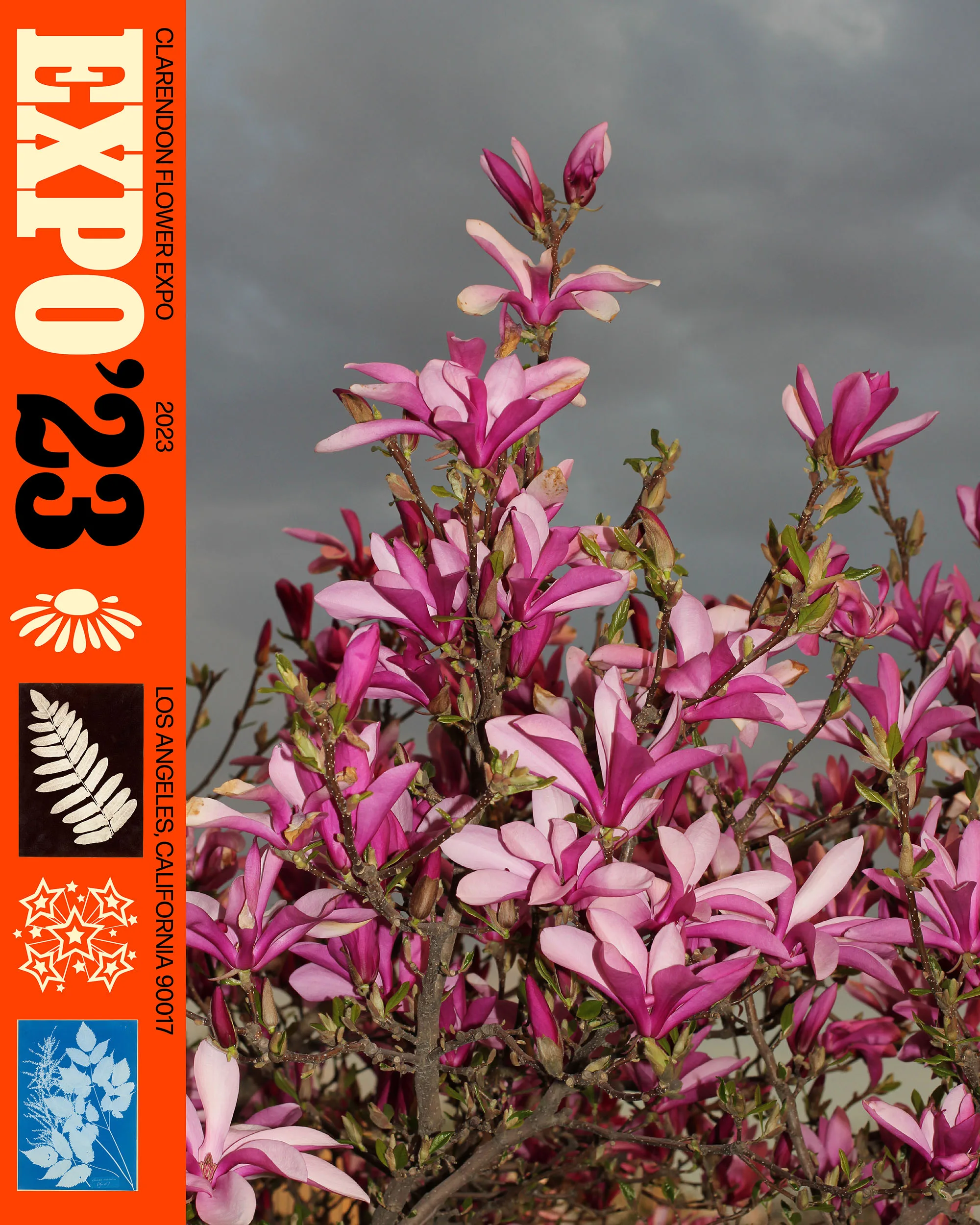
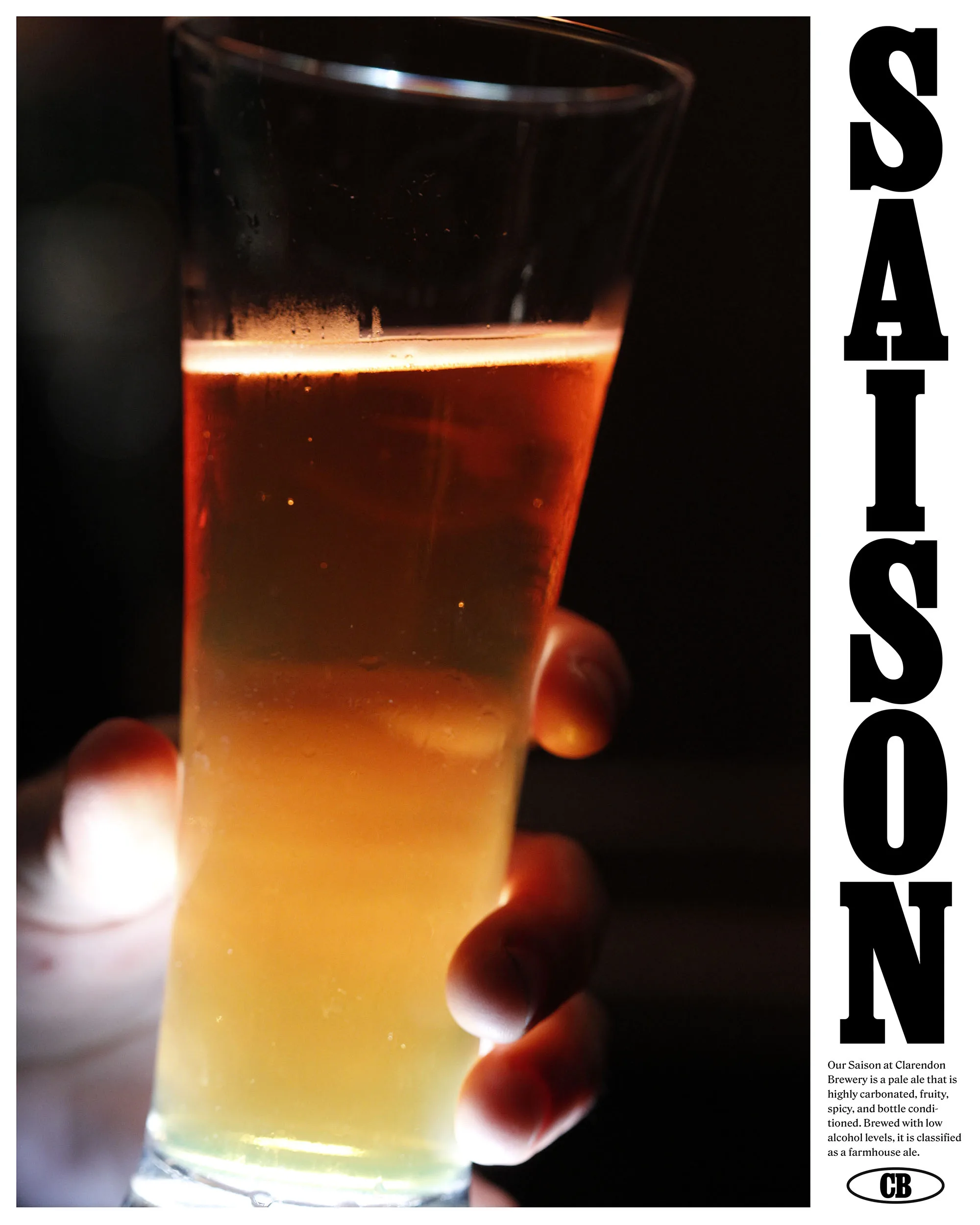
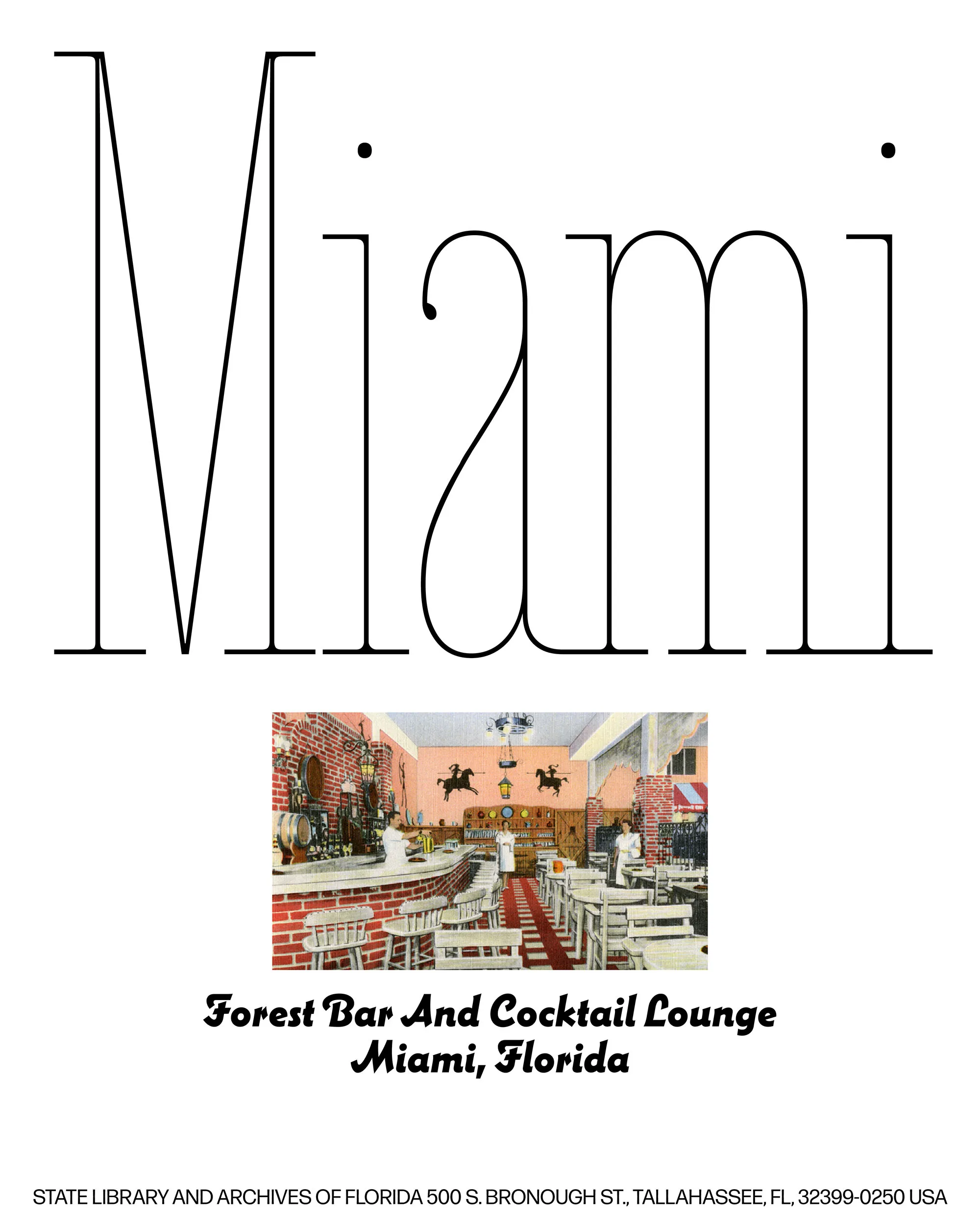
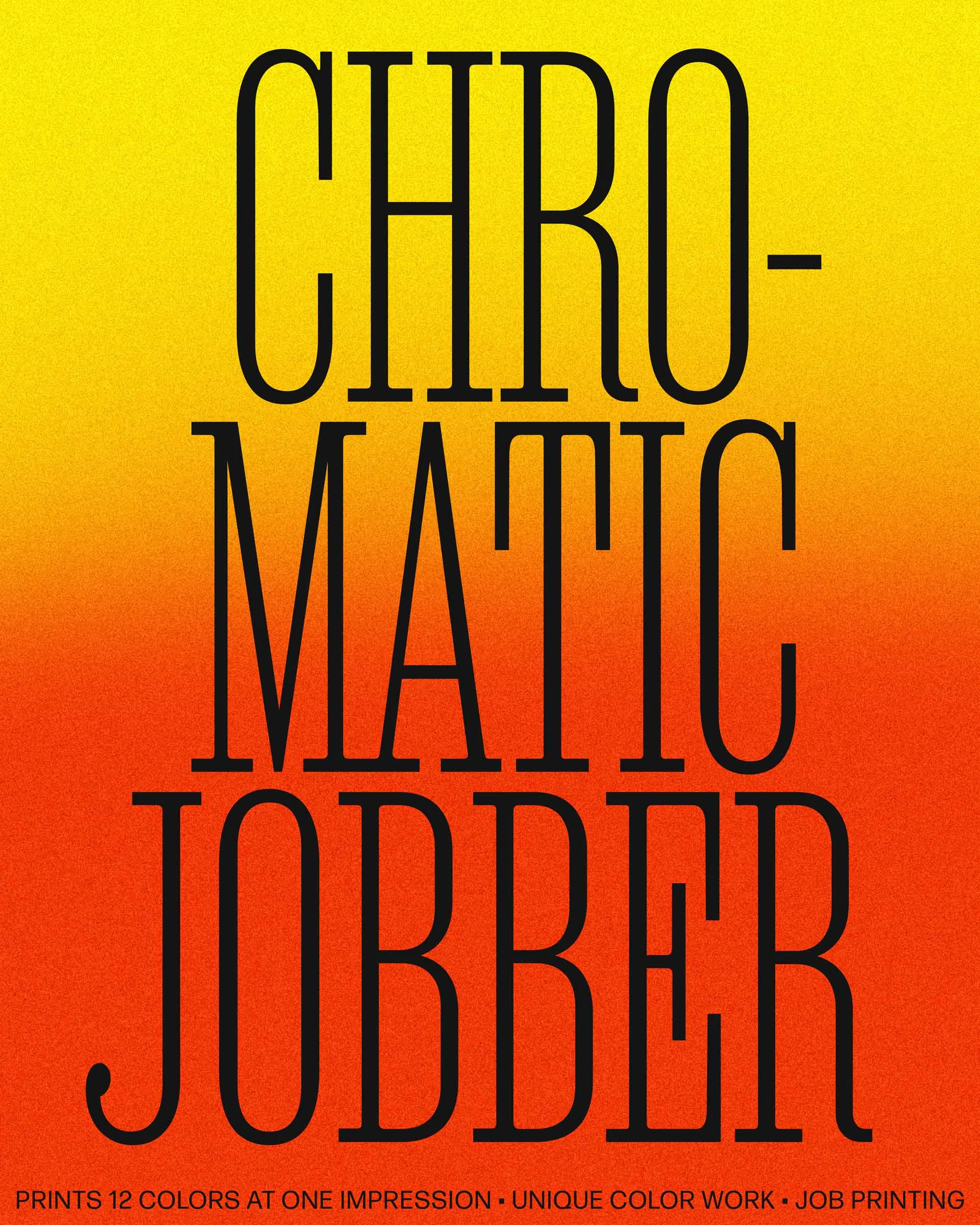
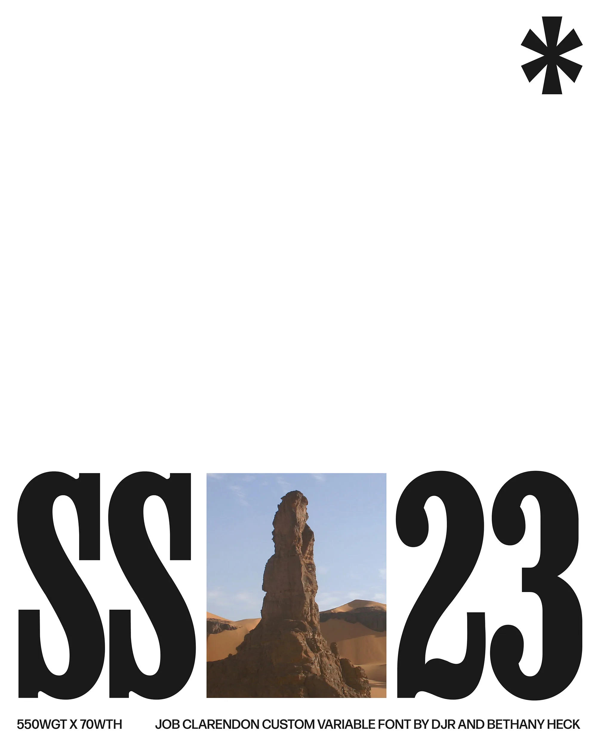
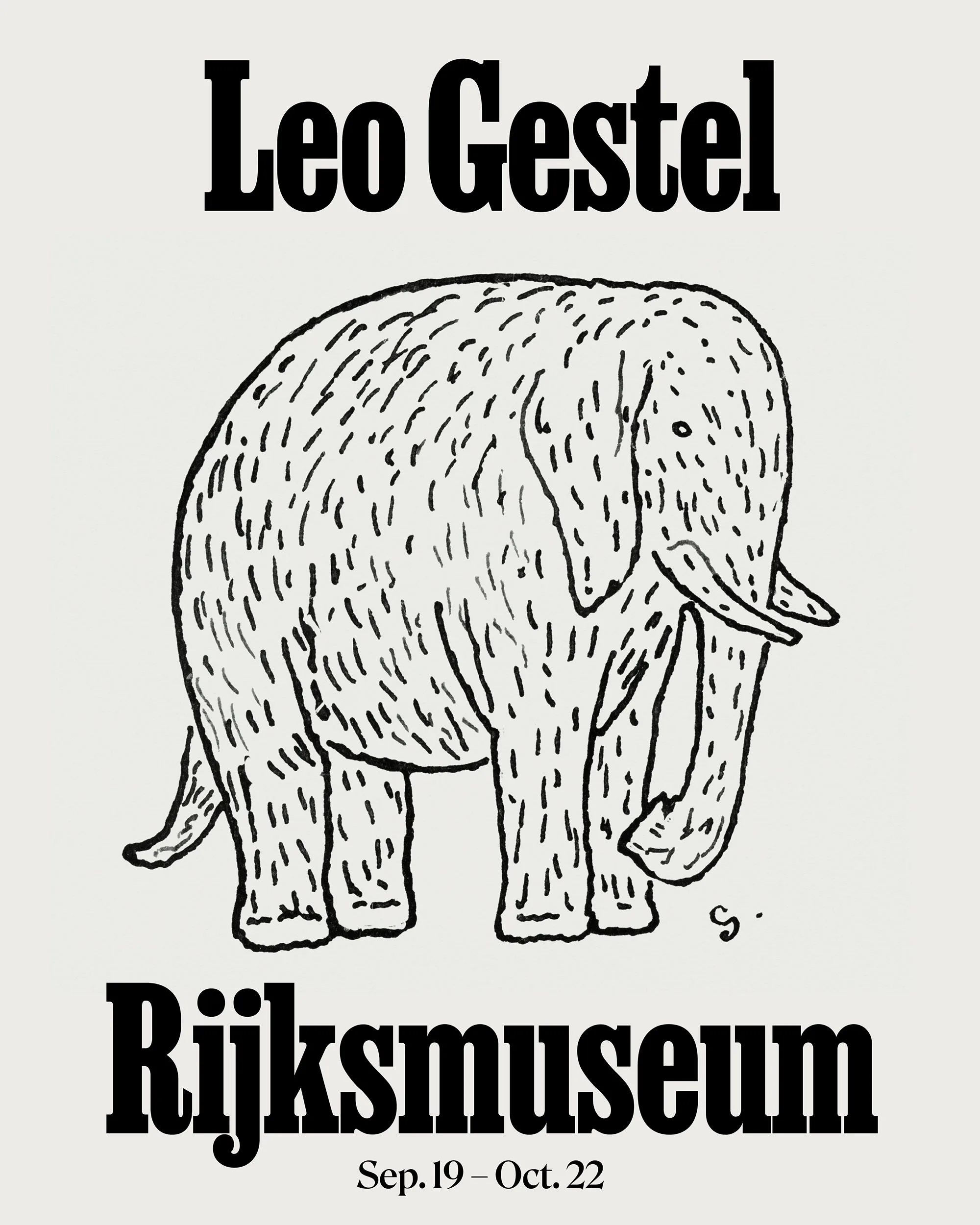
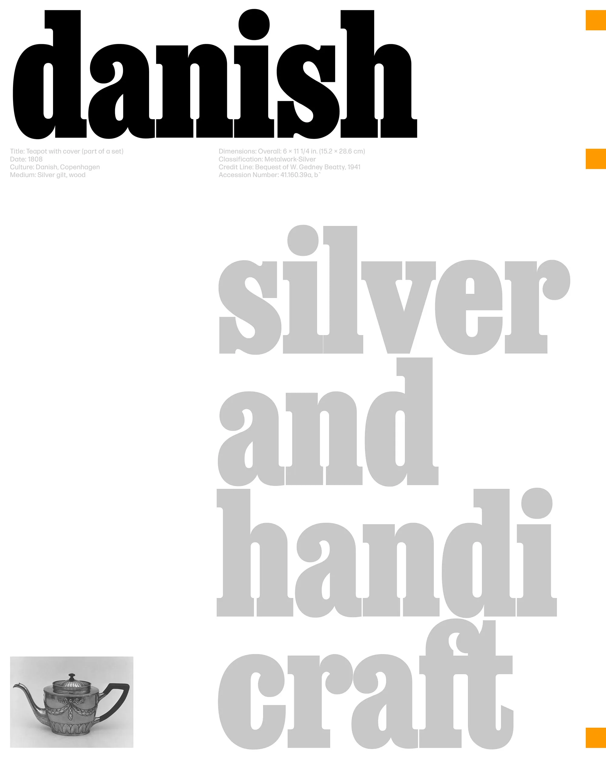
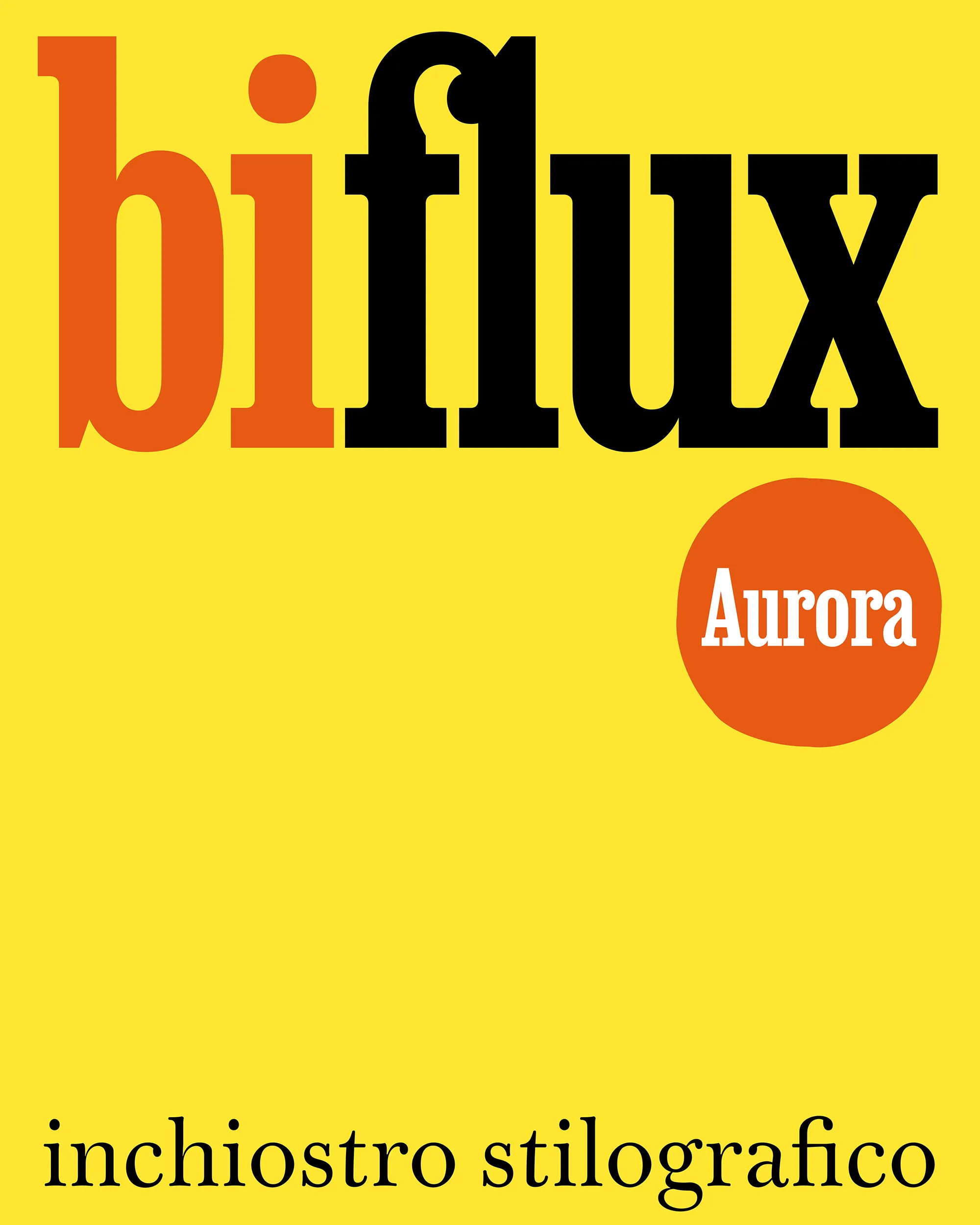
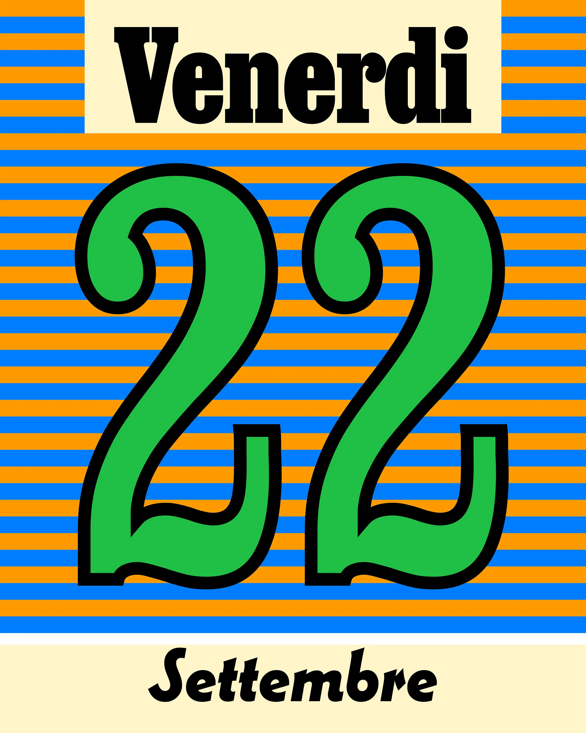
Job Clarendon is a typeface that pays homage to job printing — display-heavy designs made for posters and flyers in the heyday of letterpress printing. This page features twenty-six posters that demonstrate that the visual language of job printing is just as vital today as it was then.
The typeface was designed by Bethany Heck and David Jonathan Ross with additional drawing by Sophia Tai. The posters were designed by Noah Baker. The site was designed and coded by Phil Moody.



Widths
f
f
f
f
Weights
f
f
f
f
f
f
f
f
f
f
Job Clarendon’s weights include the bolds you’d expect from 19th century examples, but also expand into hairline styles that signal its embrace of modern type technology.

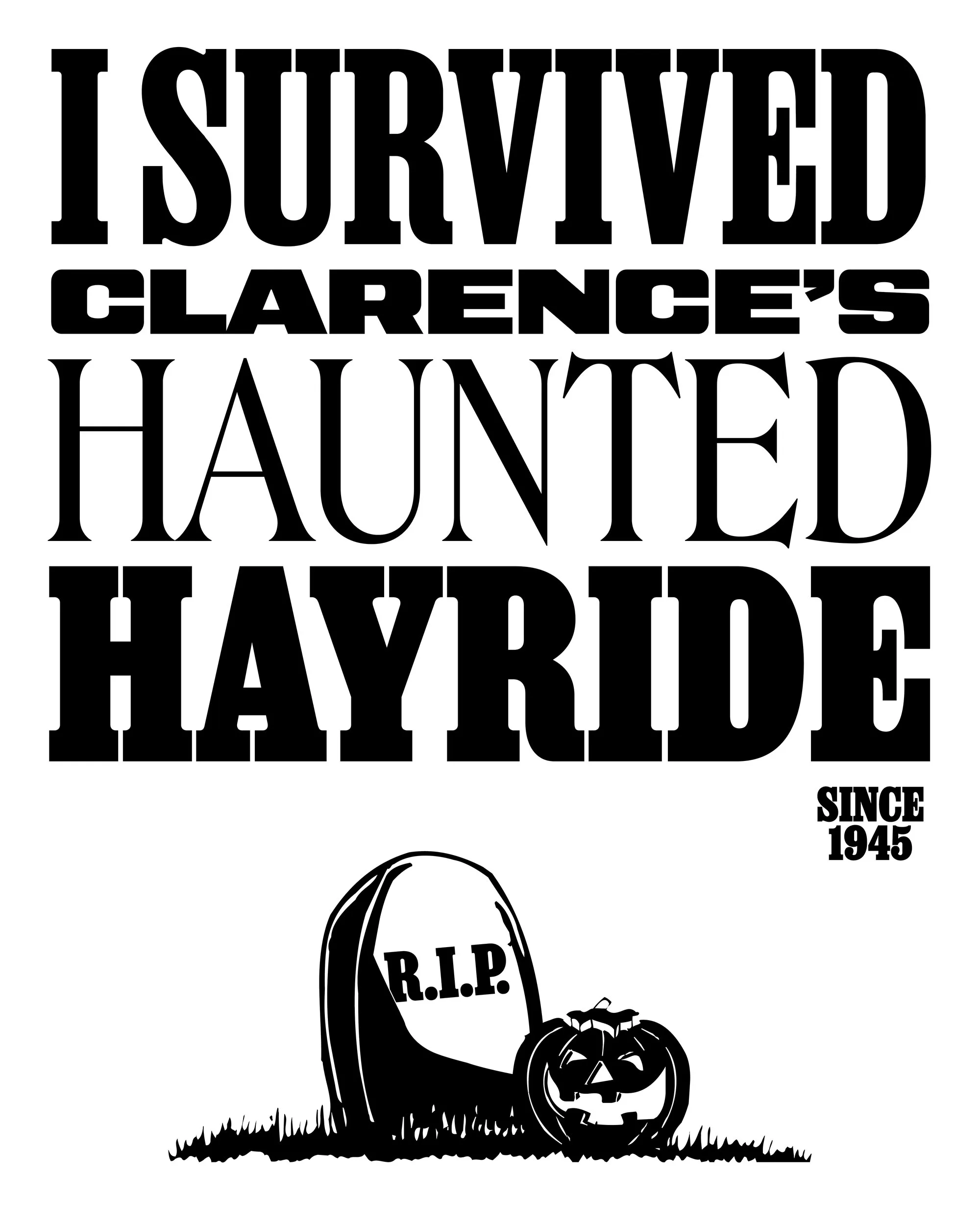
Job Clarendon’s width and weight axes allow for precision typesetting despite its heavy, bracketed serifs.
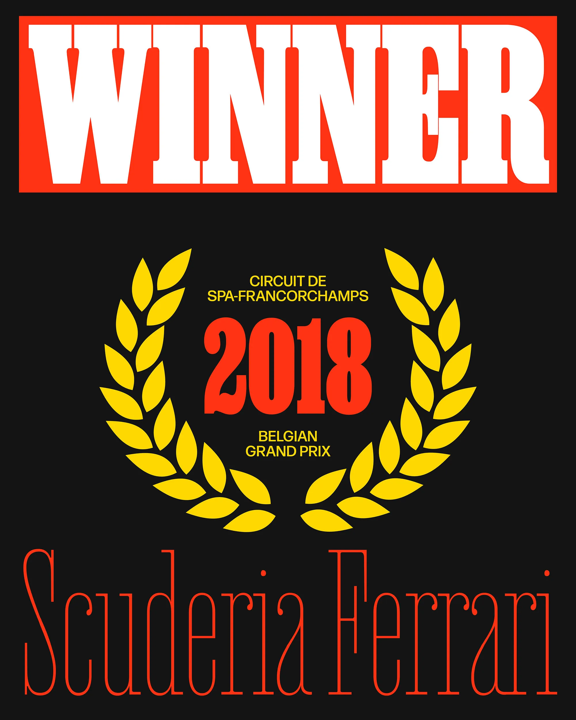
Job Clarendon offers a squared terminal stylistic set, giving it a crisper tone and bringing it closer to an Antique style.

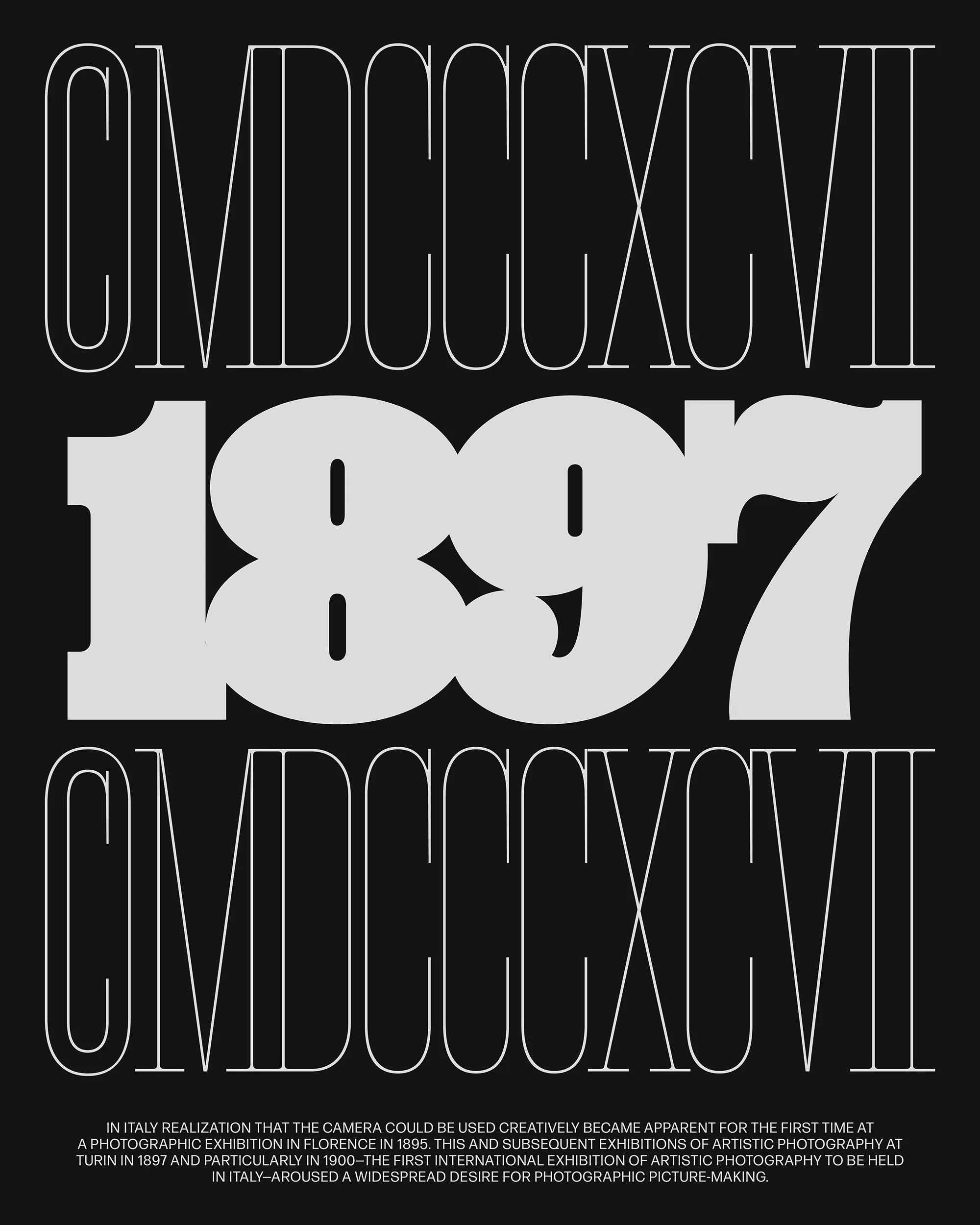
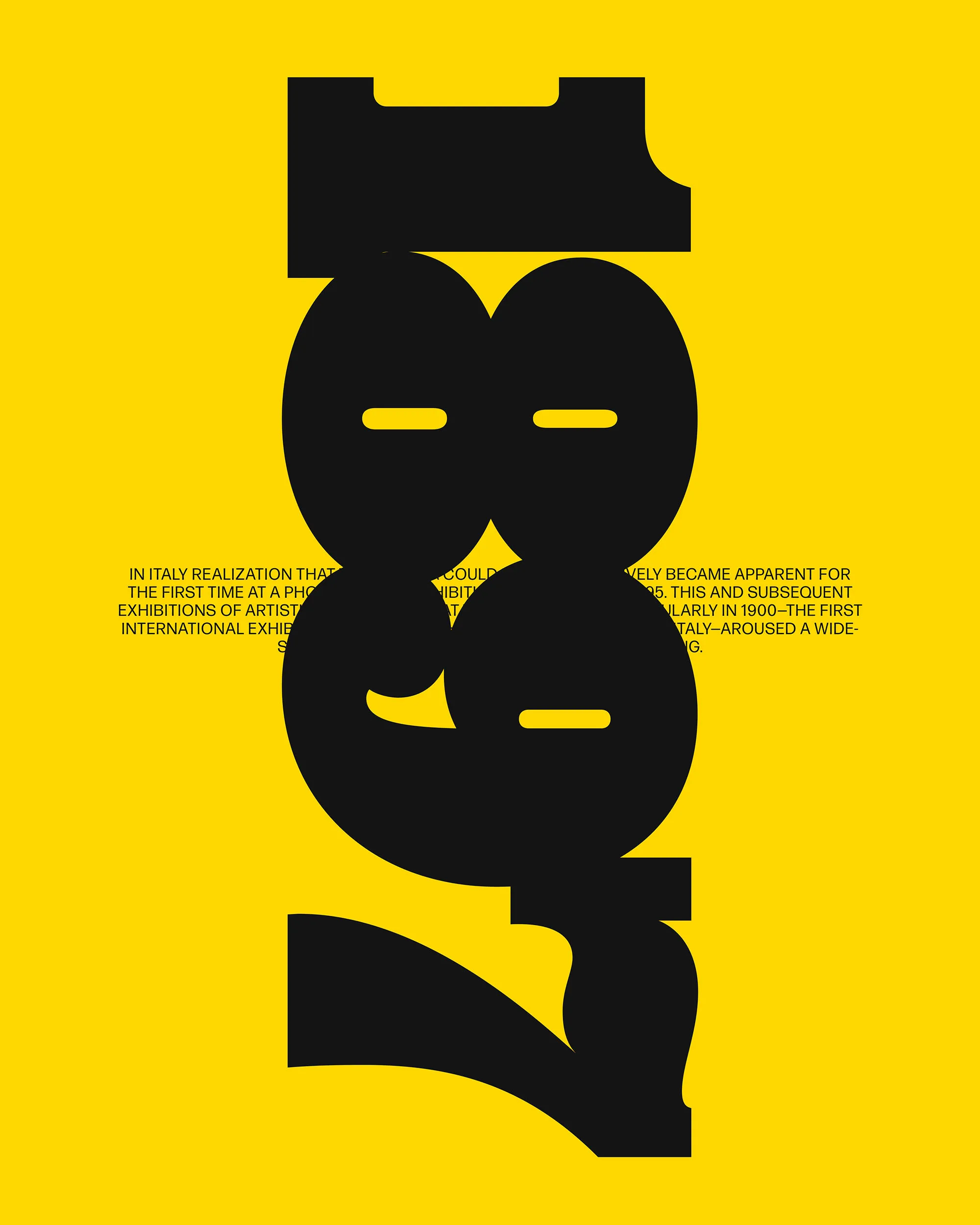
Dangerously falling toxicity
Dangerously falling toxicity
Square Terminals & Dots
Rambling banana parade
Rambling banana parade
Tailed R and A
Fettuccine & Mostaccioli
Fettuccine & Mostaccioli
Simplified C
Fettuccine & Mostaccioli
Fettuccine & Mostaccioli
Simplified T
Monumental Minimalism
Monumental Minimalism
Connected Serifs
$79,772,197 & $17,496,247
$79,772,197 & $17,496,247
Simplified 7
Job Clarendon is an homage to the Condensed Clarendon, the versatile bracketed slab serif style that was a mainstay of 19th century British and American job printing. A collaboration with Bethany Heck, this interpretation started with single hairline weight and expanded to an expansive weight range: stems get up to 45 times thicker from Hairline to Black, and the average letterform more than doubles in width.
We included several stylistic alternates in Job Clarendon to allow it to flex its personality in different ways. Swap in the simplified alternates for a cleaner presentation, or activate the tails to embrace the 19th century aesthetic.
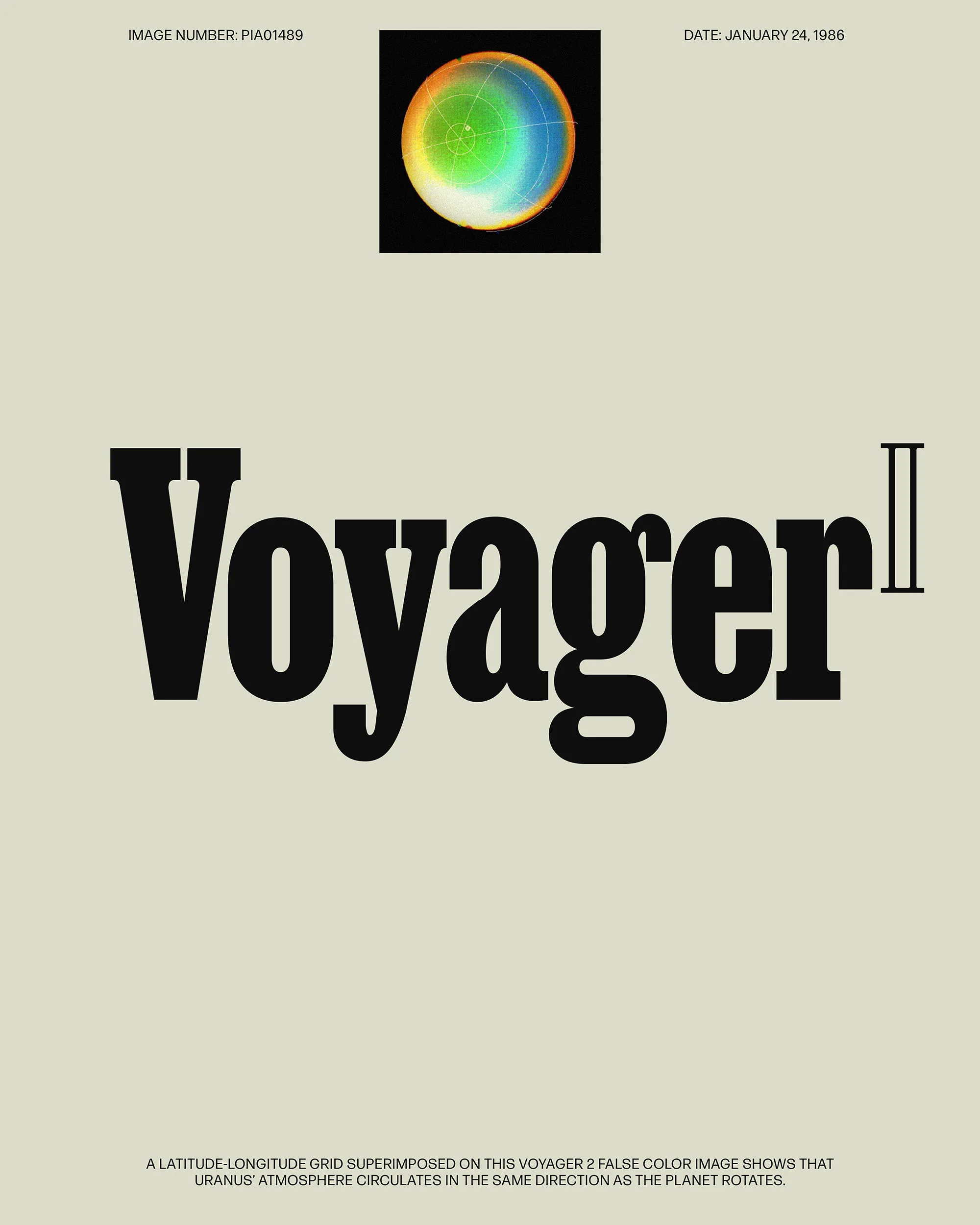

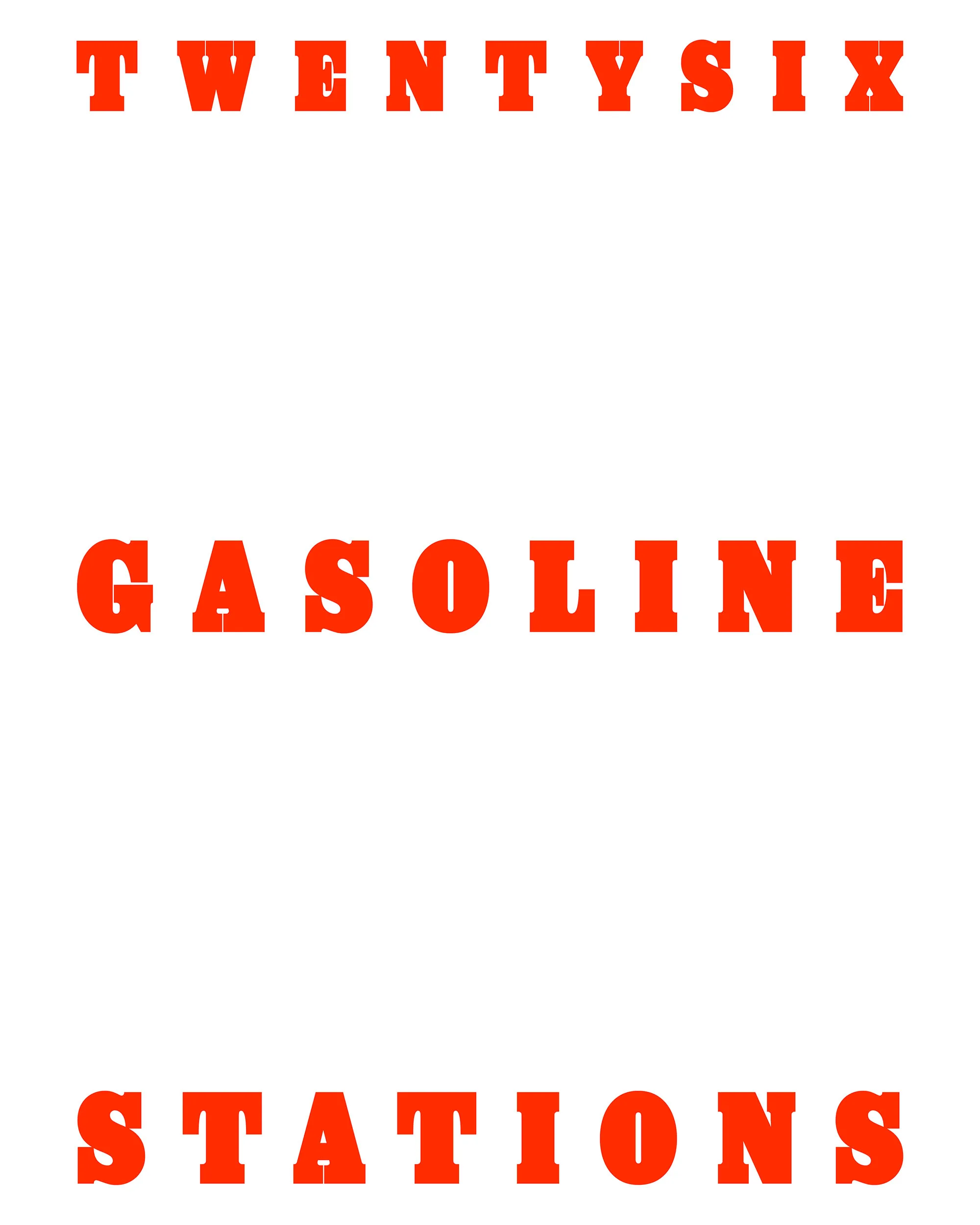

Jumper
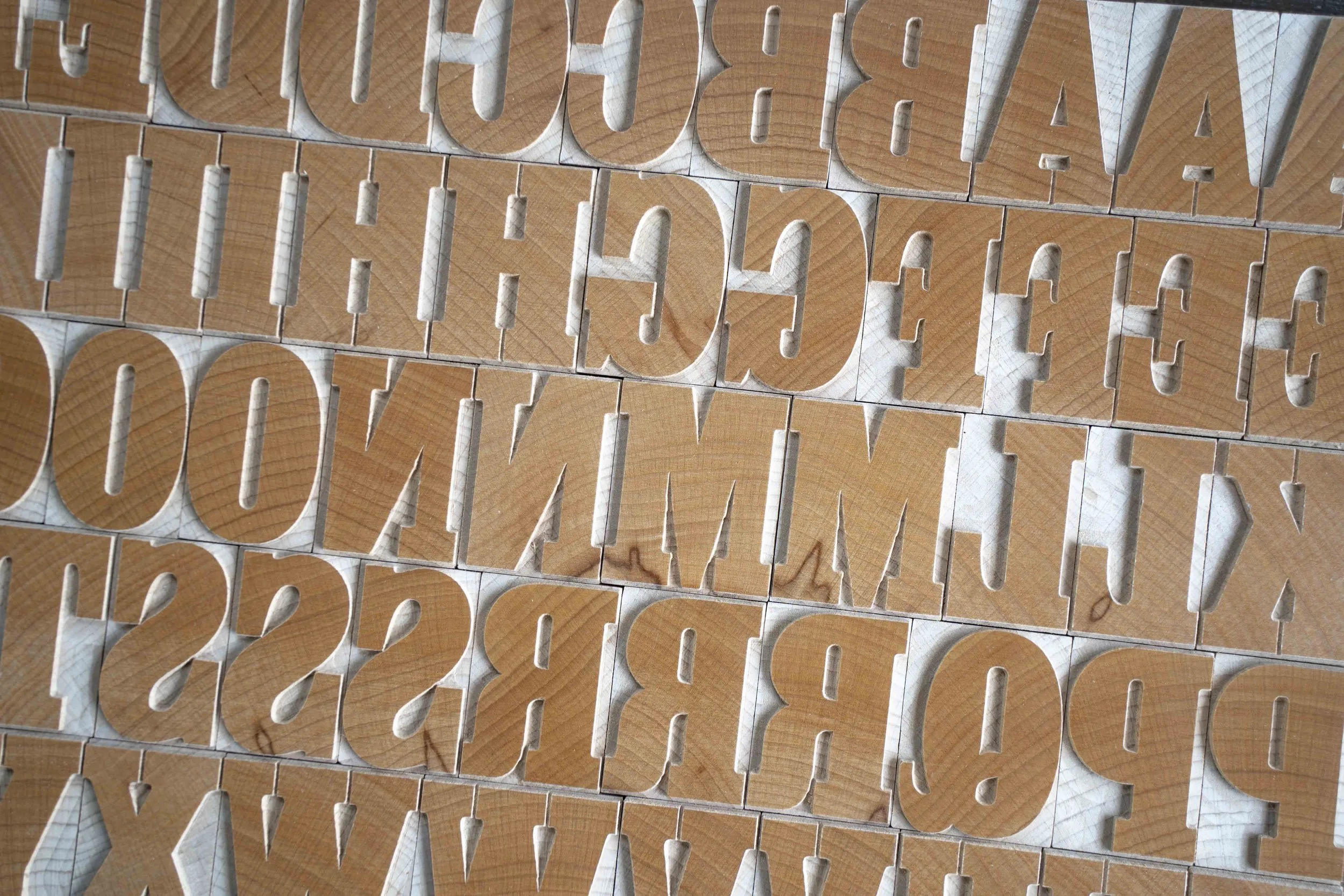
We enjoyed finding moments to lean into the soft nature of Clarendons. We leveraged sharp details when it was necessary to create counter space, but weren’t afraid to let the heavier weights feel loose. We also allowed for some serif gaps to fill at the heaviest end of the spectrum, implying that the typeface has been “overinked.”
Right Foam Legal Basic