Nickel
Gothic
Seems like nothing these days is built to last.
But Nickel Gothic is constructed with durable straight sides, square shoulders, and hefty weights that are designed to go the distance.
Nickel Gothic is a striking display sans serif that radiates with strength and energy. Its simple, blocky shapes offer little in the way of sophistication, but they more than make up for it in their raw communicative power. From Compressed to Wide, from Oblique to Backslant, it’s the perfect tool for high-impact, go-big-or-go-home typography.
Like its serifed cousin, the typeface was based on lettering found on a 1918 Chinese banknote. But, despite the fact that it is based on lettering from over a century ago, it has overtones of the midcentury sans serifs like Microgramma/Eurostile as well as squared gothics form the ’70s like Neographik and Serpentine.
While many condensed sans serifs have flat sides, Nickel Gothic’s defining feature is its flat tops and bottoms. These flat exteriors are contrasted with stadium-like interior shapes, which form pockets of weight in the corners of the letterform...I call them “shoulderpads”). These reinforced corners give Nickel Gothic its trademark strength and sturdiness, and make each word land with a thud.
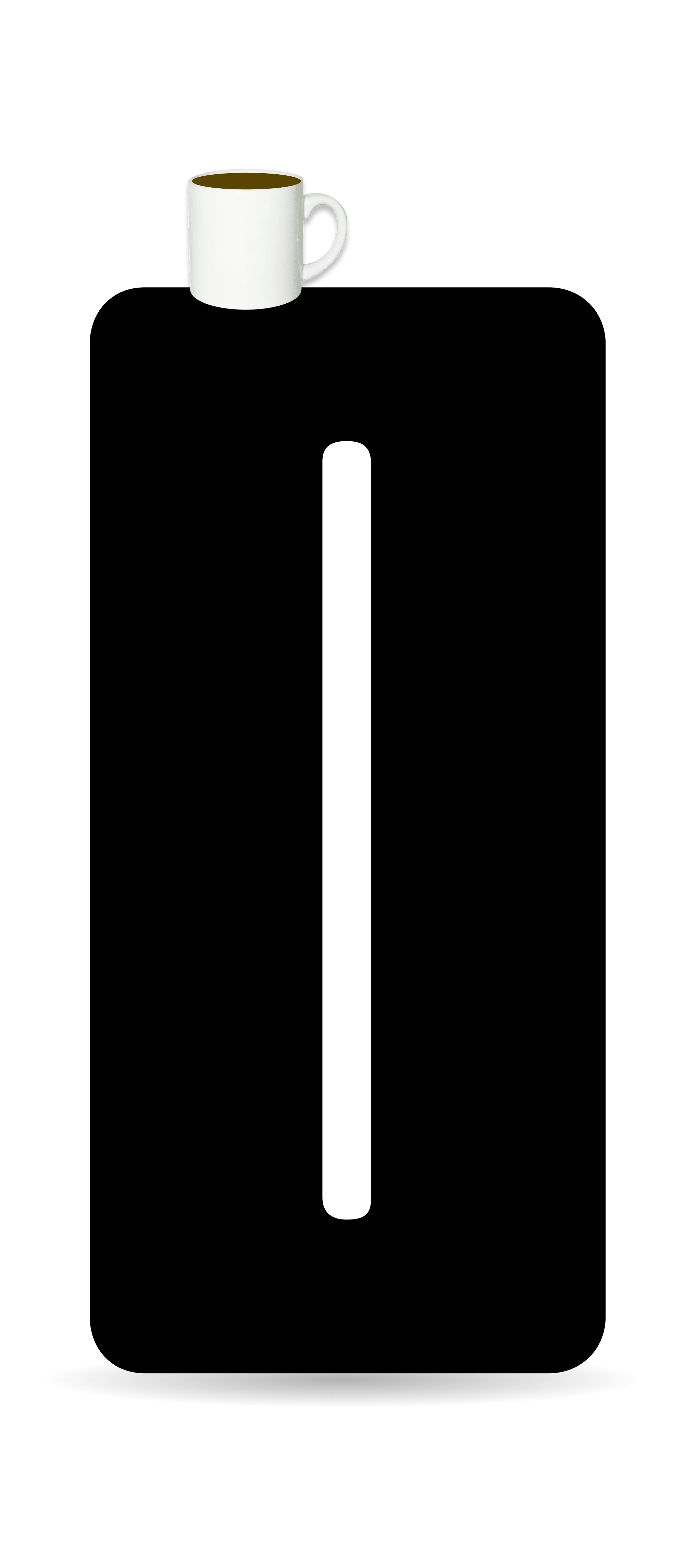
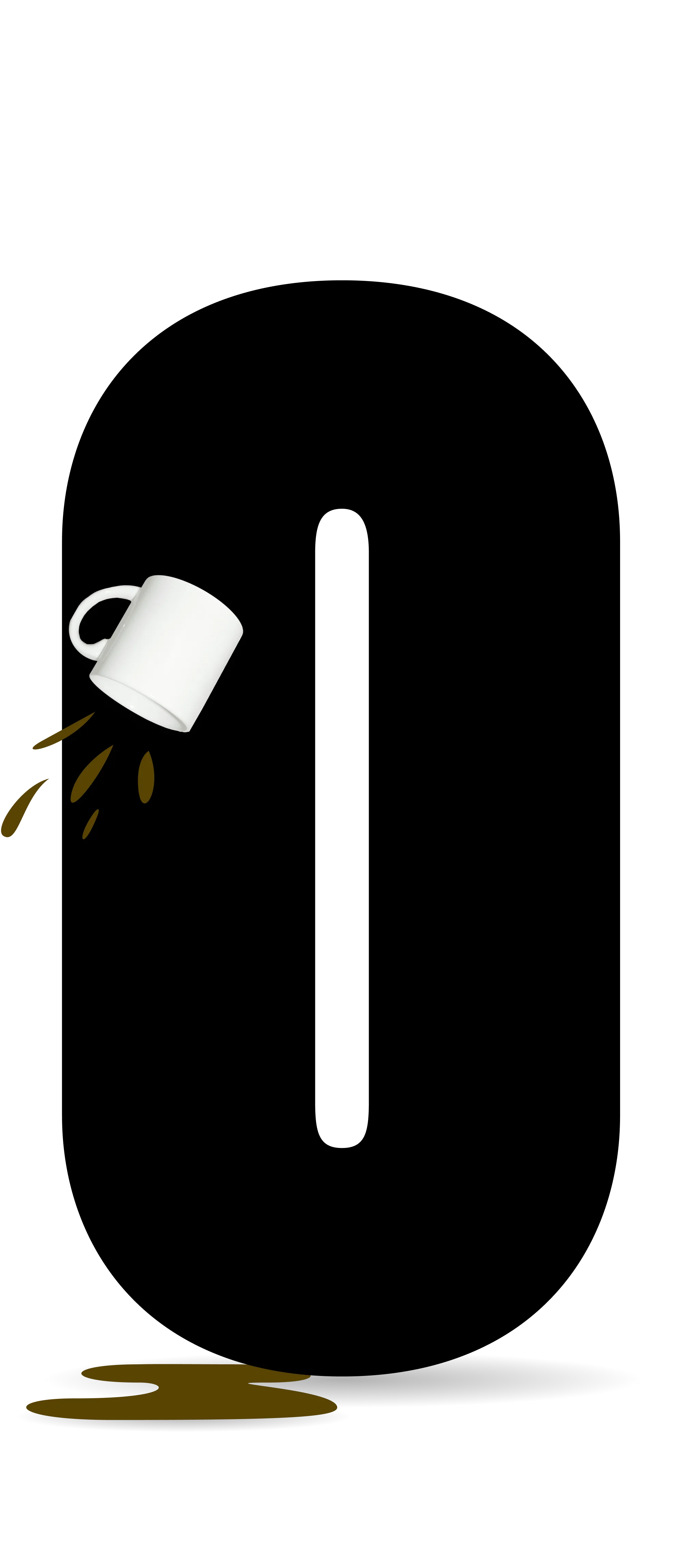
Nickel Gothic stacks neatly for easy storage.
Nickel Gothic enhances alignment with advanced Novershoot™ technology.
Nickel Gothic supports the Latin, Greek, and Cyrillic scripts in all their blocky goodness.
Alternate forms and other accessories are NOT sold separately.
Nickel Gothic puts YOU in control with precise variable axes for Slant and Width.
Variable Axis Testing Area
Proceed with caution, safety glasses required.*
ACME
SAMPLE
TEXT®
Nickel Gothic was designed by DJR with additional drawing by Bea Korsh. This webpage was designed by Henry Desroches.